
Choosing the right color profile for your MacBook M2 can significantly reduce eye strain and improve visual comfort. With the M2 chip’s stunning Retina display, optimizing color settings ensures accurate colors while protecting your eyes during extended use.
If you’ve recently upgraded to a MacBook with the M2 chip, you’re likely enjoying one of the most vibrant and sharp laptop displays on the market. The Retina display delivers rich colors, deep blacks, and incredible detail—perfect for creative work, streaming, or everyday tasks. But with all that visual brilliance comes a hidden challenge: eye strain. Staring at a bright, colorful screen for hours can leave your eyes tired, dry, or even cause headaches. That’s why finding the best color profile for MacBook M2 for eyes isn’t just about aesthetics—it’s about comfort and long-term eye health.
The good news? Apple has designed the M2 MacBook with eye-friendly features built right in. From True Tone to Night Shift, there are several tools at your disposal. But simply turning on these features isn’t always enough. To truly optimize your viewing experience, you need to understand how color profiles work and how to customize them for your specific needs. Whether you’re a designer who needs color accuracy or a student pulling all-nighters, the right settings can make a world of difference.
In this guide, we’ll walk you through everything you need to know about choosing and customizing the best color profile for your MacBook M2. We’ll cover built-in options, third-party tools, and practical tips to keep your eyes comfortable—no matter how long you’re glued to the screen.
Key Takeaways
- Use Apple’s built-in color profiles: The MacBook M2 comes with factory-calibrated profiles that balance color accuracy and eye comfort.
- Enable Night Shift for warmer tones: Reducing blue light in the evening helps minimize eye fatigue and supports better sleep.
- Adjust display brightness to match ambient light: Proper brightness prevents squinting or glare, reducing strain.
- Consider third-party calibration tools: Tools like DisplayCAL or CalMAN offer advanced customization for professional users.
- Use True Tone for adaptive color: This feature adjusts the display’s color temperature based on your surroundings for a more natural viewing experience.
- Limit screen time and take breaks: Even the best color profile can’t replace the need for regular rest using the 20-20-20 rule.
- Choose sRGB for web and general use: This standard color space ensures consistency across devices and reduces visual stress.
Quick Answers to Common Questions
What is the best color profile for MacBook M2 for eyes?
The sRGB profile is often best for eye comfort during general use, while Display P3 is ideal for creative work. Pair either with True Tone and Night Shift for optimal results.
Does Night Shift really help with eye strain?
Yes, Night Shift reduces blue light exposure, which can cause eye fatigue and disrupt sleep. It’s especially helpful during evening use.
Should I use True Tone all the time?
Most users benefit from keeping True Tone on, as it adapts the display to your environment. However, turn it off if you need consistent color for professional work.
Can I calibrate my MacBook display without expensive tools?
Yes, macOS includes a built-in calibration assistant that lets you create a custom profile using your eyesight and preferences.
Is dark mode better for your eyes?
Dark mode can reduce strain in low light, but it may cause issues like halation for some. Use it wisely and adjust brightness accordingly.
📑 Table of Contents
Understanding Color Profiles and Eye Comfort
A color profile is essentially a set of instructions that tells your display how to show colors. Think of it like a recipe for color accuracy. Different profiles—like sRGB, Adobe RGB, or Display P3—are designed for different purposes. For example, Adobe RGB offers a wider color range for professional photo editing, while sRGB is the standard for web content.
But when it comes to eye comfort, the goal isn’t always the widest color gamut. In fact, overly saturated or cool-toned colors can increase visual fatigue. The best color profile for MacBook M2 for eyes strikes a balance between accuracy and comfort. It should reduce harsh contrasts, minimize blue light, and adapt to your environment.
Apple’s Retina display uses the Display P3 color space by default, which offers more vibrant reds and greens than sRGB. While this looks stunning, it can be intense during long sessions. That’s why adjusting your profile—or using features that modify it—can help ease the strain on your eyes.
Built-In Apple Features for Eye Comfort

Visual guide about Best Color Profile for Macbook M2 for Eyes
Image source: ideviceworld.com
Apple has packed the MacBook M2 with several features designed to protect your eyes. These aren’t just marketing gimmicks—they’re scientifically backed tools that can make a real difference.
True Tone: Adaptive Color Temperature
True Tone is one of the most underrated features on the MacBook M2. It uses ambient light sensors to adjust the color temperature of your display based on the lighting around you. In a warm, dimly lit room, your screen will shift to softer, warmer tones. In bright daylight, it becomes cooler and brighter.
This mimics how your eyes naturally adapt to different environments, reducing the shock of a stark white screen in a dark room. To enable True Tone, go to System Settings > Displays > Advanced > True Tone. Most users find this feature essential for eye comfort, especially during evening use.
Night Shift: Reduce Blue Light at Night
Blue light, which is emitted by most digital screens, can interfere with your circadian rhythm and cause eye strain. Night Shift shifts your display’s colors to the warmer end of the spectrum after sunset, reducing blue light exposure.
You can customize Night Shift to turn on automatically from sunset to sunrise or set a custom schedule. Go to System Settings > Displays > Night Shift. You can also adjust the color temperature—choose “Less Warm” or “More Warm” depending on your preference. Many users report better sleep and less eye fatigue after enabling this feature.
Auto-Brightness and True Tone Together
Combining True Tone with auto-brightness creates a dynamic display that responds to both light and color temperature. This dual adaptation helps maintain a consistent, comfortable viewing experience throughout the day. To enable auto-brightness, go to System Settings > Displays and toggle on “Automatically adjust brightness.”
Choosing the Right Color Profile
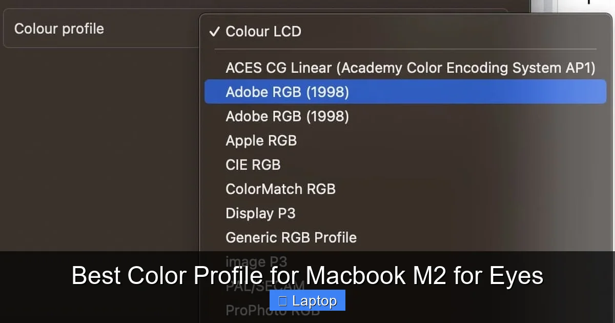
Visual guide about Best Color Profile for Macbook M2 for Eyes
Image source: appletoolbox.com
While Apple’s default Display P3 profile is excellent for media and design, it may not be the most comfortable for everyday use. Here’s how to choose the best color profile for MacBook M2 for eyes.
sRGB: The Standard for Web and General Use
If you spend most of your time browsing the web, writing documents, or using productivity apps, sRGB is often the best choice. It’s the standard color space for the internet, meaning colors will appear consistent across websites and devices. It’s also less saturated than Display P3, which can reduce visual fatigue.
To switch to sRGB, go to System Settings > Displays > Advanced > Color Profile and select “sRGB IEC61966-2.1.” This profile is ideal for users who don’t need wide color gamuts but want a more relaxed viewing experience.
Display P3: For Creatives and Media Lovers
If you’re editing photos, watching HDR movies, or designing graphics, Display P3 offers richer, more vibrant colors. However, it can be more taxing on the eyes during long sessions. To reduce strain, pair it with True Tone and lower brightness.
Custom Calibration: For Precision and Comfort
For users who want the ultimate control, custom calibration is the way to go. You can use macOS’s built-in calibration assistant (System Settings > Displays > Advanced > Color Profile > Calibrate) to create a personalized profile. This tool walks you through adjusting gamma, white point, and brightness to match your environment and preferences.
While this method is free, it relies on your eyesight and may not be as accurate as professional tools. Still, it’s a great starting point for improving comfort.
Third-Party Calibration Tools
Visual guide about Best Color Profile for Macbook M2 for Eyes
Image source: macobserver.com
If you’re serious about color accuracy and eye comfort, consider investing in a hardware calibration device. These tools, like the Datacolor SpyderX or X-Rite i1Display Pro, measure your screen’s output and create a precise color profile.
Benefits of Hardware Calibration
Hardware calibrators offer several advantages:
- More accurate color reproduction
- Reduced eye strain through optimized gamma and white balance
- Consistent performance across different lighting conditions
These tools are especially useful for photographers, video editors, and designers who need reliable color. But even casual users can benefit from the improved comfort and clarity.
Popular Software Options
Pair your hardware with software like DisplayCAL (free) or CalMAN (premium) for advanced control. These programs allow you to fine-tune color temperature, luminance, and contrast to reduce eye fatigue. For example, setting a slightly warmer white point (around 6000K instead of 6500K) can make text easier to read.
Practical Tips for Reducing Eye Strain
Even with the best color profile, long screen time can still harm your eyes. Here are some practical tips to enhance comfort:
Follow the 20-20-20 Rule
Every 20 minutes, look at something 20 feet away for at least 20 seconds. This simple habit helps relax your eye muscles and reduces fatigue.
Adjust Your Workspace Lighting
Avoid using your MacBook in complete darkness. Use soft, indirect lighting to reduce glare and contrast between the screen and surroundings.
Use Dark Mode Wisely
Dark mode can reduce eye strain in low-light conditions, but it may cause halation (glowing text) for some users. If you experience discomfort, try a dark gray background instead of pure black.
Increase Text Size and Contrast
Make text easier to read by increasing font size and using high-contrast color schemes. Go to System Settings > Accessibility > Display to adjust these settings.
Conclusion
Finding the best color profile for MacBook M2 for eyes is about more than just picking a setting—it’s about creating a sustainable, comfortable viewing experience. Start with Apple’s built-in features like True Tone and Night Shift, then experiment with color profiles like sRGB for everyday use. For professionals, consider hardware calibration tools to fine-tune accuracy and comfort.
Remember, no color profile can replace good habits. Take regular breaks, adjust your lighting, and listen to your eyes. With the right setup, your MacBook M2 can be both a powerhouse for productivity and a gentle companion for your eyes.
Frequently Asked Questions
What color profile does the MacBook M2 use by default?
The MacBook M2 uses the Display P3 color profile by default, which offers a wider color gamut and more vibrant colors compared to sRGB.
How do I change the color profile on my MacBook M2?
Go to System Settings > Displays > Advanced > Color Profile, then select your preferred profile from the list, such as sRGB or Display P3.
Does True Tone affect color accuracy?
Yes, True Tone adjusts color temperature based on ambient light, which can affect color accuracy. Turn it off for professional color-critical work.
Can a wrong color profile cause eye strain?
Yes, overly saturated or cool-toned profiles can increase visual fatigue. Choosing a balanced profile like sRGB and using eye comfort features helps reduce strain.
Are third-party calibration tools worth it for eye comfort?
They can be, especially for professionals. Hardware calibrators create precise profiles that improve both color accuracy and visual comfort over time.
How often should I recalibrate my display?
For most users, recalibrating every 3–6 months is sufficient. Professionals may need to calibrate monthly to maintain accuracy.